You have invested months of man hours into building a cost model. You might have a model in Excel, in a legacy data cube or in a COTS software tool/module designed for the purpose (Magic Orange, Nicus, Apptio, EZTBM, etc..). Regardless of the backend analytic engine you are using, the main interface point for most in the organization is going to be the reports you design and publish. All the long weeks of collaboration with EA and the Service Owners to define services, even longer with data owners understanding data sources and their readiness, and then the time to build the model itself are summarized and exposed only in the reports that are consumed. The best way to spread adoption of your work is it to have reports that are meaningful and keep your customers coming back.
A report can have four general classes of reactions when viewed:
- <silent headscratch>
- “You have to be kidding me”
- “Oh, that is interesting” or “Ah, now that makes sense”
- “Hey, this means we can solve…..”
The first class is generally the result of badly designed reports. That is a well covered topic that we are not going to explore here- do a quick google search on “Good report design” and you will find thousands of options for learning more.
The second is problematic and needs to be solved. It is generally the result of bad socialization of a new model or method, or data with surprise gaps. The topic of Data Maturity has been discussed here before, and will certainly be addressed again. Socialization needs not just a post but a whole series of posts to really explore, but let’s summarize with “If you are surprising people with a new interpretation of their work in front of others, it is going to go badly.” Remembering to engage stakeholders along the way when making changes is important in any work- and ITFM does not escape this.
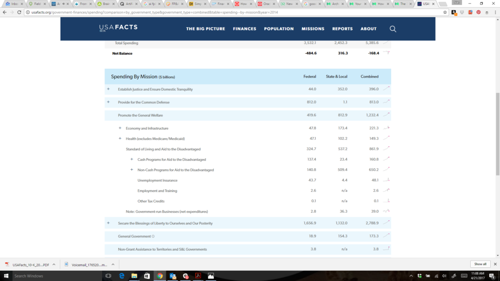
The third describes reports that are explanatory. They provide information that explains (cost, spend, source of labor, type of spend, etc…) and is likely interesting- once, unless it changes frequently. These types of reports are useful and required for annual reports or one time analysis. However, once I understand that we spend 60% of our IT budget on labor and that is justified spend, I really do not want to see that same stat (or that it is 61% or 59%) over and over again — month over month. Only KPIs that are volatile or are being measured as part of a challenge (to increase or decrease) make sense to monitor month over month. This is especially true when I cannot understand the driver for that 60%. The new data site that Steve Ballmer and his partners released this week: USAFacts.org is a government transparency website that is intended to give a 10K/informational view of government spending.
I am going to be a bit heretical here and NOT jump on the band wagon about how amazing and wonderful this site is. Don’t get me wrong- the interface is gorgeous and navigates beautifully. I love the look of it. I just wanted this to be so much more. When you drill into the details of the financials, it is nicely aligned with the “business” of government. But take a look at this drill into 2014 spending.

It shows great little embedded spark charts off to the right on each line item to show trends….. but absolutely NO way to drill to anything that gives that meaning. WHY was there an increase/decrease? Did the cost of the service go up? Was the service consumed more? Did the nature of the service change?
This is a prime example of an information analysis that leaves me with lots of questions, and I walk away saying “well, that is interesting”.. but with no increase in understanding at all.
The last is the goal we all strive for, and is so hard to achieve — that series of charts and graphs that allows someone to look at it and walk away constructing an action plan for change. It presents information that is truly actionable. The call for actionable reporting has been increasing in volume for the last few years across domains as diverse as medical research and retail. IT Service reporting is no different. When your report shows a segment or unit that the information consumer can control or influence, then it is truly actionable. Actionable reports empower their users and keep them coming back time and time again for more insights.
What percent of your reports are Explanatory vs Actionable? How have you successfully empowered your users?

